
Rethinking Brand Elements Companies Overlook
By Tim Youngs
When people think of branding, they often default to tangible, hard assets such as logos, slogans, and spokespeople. But a brand is more than just a logo. Strong brands invest time in understanding their brand identity and how they relate to their target customers.
In this blog, I’ll cover 5 brand elements companies often overlook, including visual assets and strategic positioning tips. Read to learn about:
A Consistent Color Palette
Evolving Logos & Symbols
Poignant Taglines & Key Messages
A Deep Understanding of Your Brand Archetype
Branded Spaces, Signage, and Wayfinding
Need a deeper dive into your branding? Schedule a strategic planning workshop with our team!
What Are Brand Elements?
Brand elements are the tangible and intangible assets of your company’s identity. They typically include your company name, logo mark, and distinct colors, all of which help audiences recognize your brand over similar businesses across different platforms.
All consumer-client touchpoints are opportunities to enforce positive emotional cues with branded experiences.

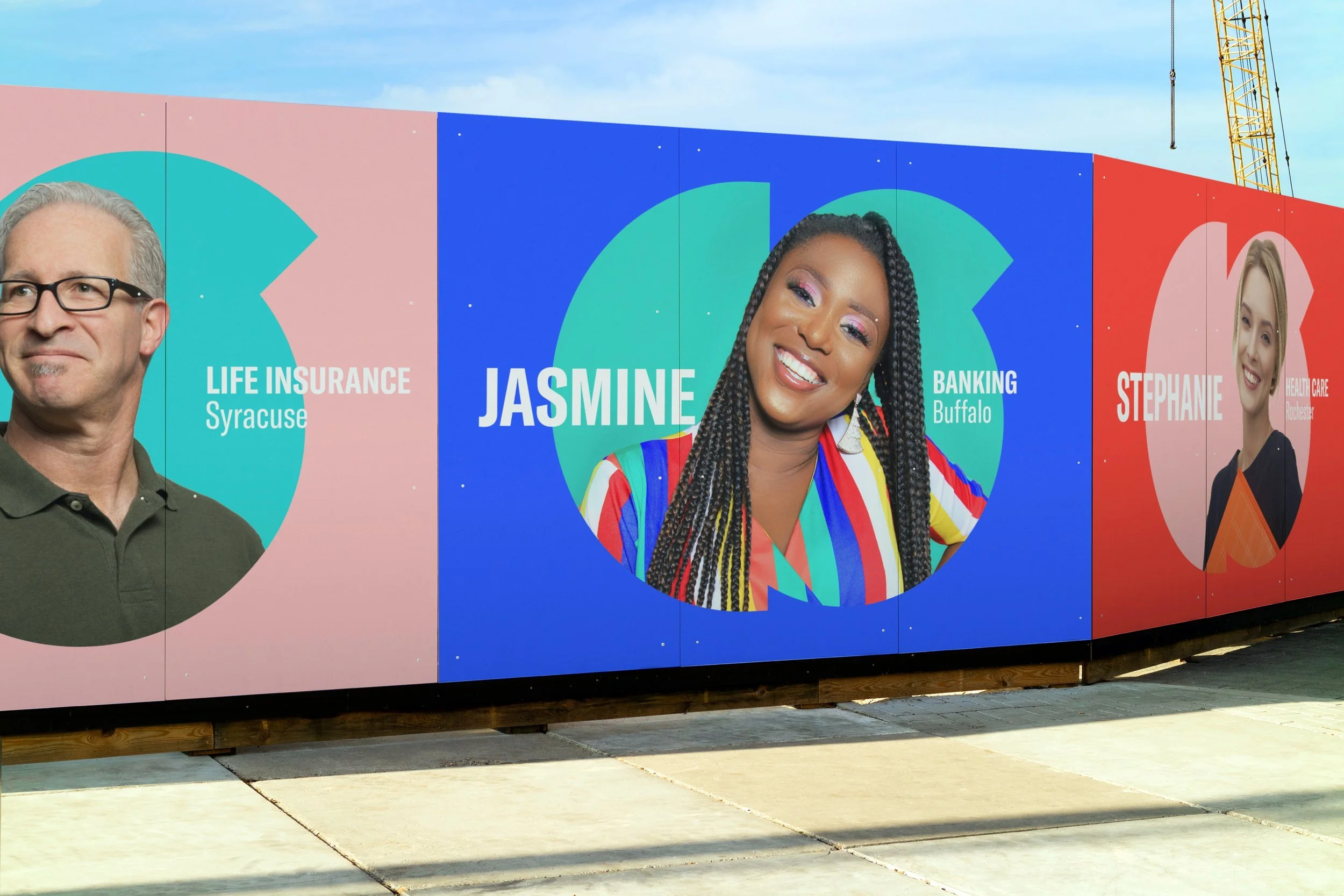
Supercuts Rochester's social media mock-ups by Brandmint.
Tangible Brand Elements
You can think of tangible brand elements as anything you can see, touch, and physically interact with. I’ve listed a few common ones above. However, depending on your type of business, there may be other assets to help you maximize your brand awareness, such as your product packaging, employee uniforms, business cards, letterheads, and even email signatures.
The key is identifying all potential touchpoints a client could have with your brand before curating the experience.
It’s about fortifying the brand.
Think of it this way: consistent tangible branding is like getting a new set of clothes and doing your hair before a job interview—where you’ll demonstrate that you’re the right pick. It’s about putting your best foot forward and ensuring the book cover reflects its contents!
Intangible Brand Elements
Companies often give less importance to intangible brand elements such as your company’s attitude, approachability, and customer service policy. But these are critical human contact points consumers expect when searching for value. Well-crafted intangible brand elements can become the basis for your brand’s internal and external culture.
Disney’s customer service training excels in this regard. Not only do they focus on building their team’s ability to anticipate customer needs, but they also create tiered procedures at every employee level. This means everyone can craft a positive experience, and there are clear guidelines on escalations.
Even how you answer the phone or shake hands in a meeting can reflect your brand.
5 Brand Elements That Companies Overlook
I’ve covered a few brand elements that companies might neglect when building their branding. Now, let’s dive into more common elements companies invest in and how they might fall short. Use this guide as a starting point when thinking through your brand’s identity.
1. A Consistent Color Palette
Career Start Staffing Agency partners with Brandmint to rebrand with bold, new colors.
Choosing the right color palette can communicate a lot at a glance. Not only can colors elicit certain feelings from your audience (often culturally specific), but they can also help you establish your branding with fewer brand elements.
Stand out From Competitors – Rather than choosing obvious colors that relate to your market, try picking a bold color to stand out. For Career Start’s rebrand, the team rejected the deep blues and reds typically associated with staffing agencies. They wanted to disrupt the market and showcase their personality, so they chose a bright, primary blue alongside bold, youthful colors instead.
Recognizable at a Distance – Colorful packaging means audiences can register your brand at first sight without thinking about it. Salvatore’s Old Fashioned Pizzeria uses vivid pink delivery boxes that can be spotted a mile away. Anyone carrying their pink box becomes a recognizable brand ambassador.
Consistency Without a Logo – Instead of stamping your logo on every asset, use brand colors to craft an adaptable visual language. Bank of America combines everyday items in blue and red with charts to evoke their branding on Instagram. This allows them to vary their style and tone while maintaining visual consistency.
2. Evolving Logos & Symbols
There are hundreds of blogs about how to design logos, where to draw inspiration, and what typography you should choose. While I’m passionate about all of those, I want to talk about the evolution of logos and symbols when going through a rebrand.
Case in point: Tropicana’s infamous rebrand fiasco.

Tropicana’s packaging circa. 2007 (left) and their 2009 rebrand (right).
In 2009, Tropicana invested $35 million to overhaul its brand, opting for a modern, sleek look. The new packaging featured a glass of orange juice split between the front and side of the bottle. The logo was oriented vertically along the right side of the glass instead of staying front and center.
Within the first month, Tropicana lost $20 million in sales because its existing customer base couldn’t identify the product on shelves.
Tropicana’s branding hinged on its iconic orange with a red and white straw. By removing the straw-studded orange, shoppers had a harder time finding the bottle at a glance. Similarly, its previous logo featured a darker hue of green with a relatively thick width. Reorienting the logo to the side made the font illegible for shoppers scanning shelves.
So, what can we learn from this?
Change Intentionally – Before rebranding or refreshing, ask yourself why you want to change. What goal does it achieve? How will your audience respond to the change? Being intentional with your design and underlying strategy deepens your brand narrative.
Keep Core Elements – There’s no point in building a specific brand, only to throw it away. Identify the symbols and values that people intrinsically associate with your brand. Then, maintain those core elements in your next iteration. That doesn’t mean you can’t breathe new life into your logo and symbols, but you must give people reference points.
Contextualize Your Design – What works in isolation might not work in a live setting. Tropicana’s bottle was illegible when placed in a sea of competitors. Shoppers couldn’t see key information on the side of the bottle since they were covered when stacked on shelves. Keep your designs human-centric.
3. Poignant Taglines & Key Messages
Companies often go for lofty buzzwords when writing taglines and key messages—probably because it makes them feel good and important. But good taglines should be memorable and communicate a key message about your brand. I recommend starting simple (it’s clear and to the point).
Ask yourself:
What do you want your audience to take away from your brand?
Does your tagline communicate your service accurately?
Can you hit your key message in about 5 words?
Can you come up with 3 options to rotate through, each reflecting your brand’s mission, philosophy, or core benefit?
Once you have the functional ideas, start editing to add memorable elements. Look for a word or phrase that resonates emotionally with your target audience. Try thinking about alliteration, rhythm, flow, and play on words. TextFX by Google is a great AI tool to jumpstart your creativity!
4. A Deep Understanding of Your Brand Archetype
A brand archetype is a way of categorizing brands into high-level “roles” that are easily recognizable across cultures and time. It’s a direct descendant of the Meyers-Briggs personality tests and Carl Jung’s concepts, which were adapted to a marketing model and came to prominence in the early 2000s.
In marketing, the 12 archetypes are:
The Innocent
The Everyman
The Hero
The Outlaw
The Explorer
The Creator
The Ruler
The Magician
The Lover
The Caregiver
The Jester
The Sage
Brandmint’s strategic planning workshops help clients identify their dominant and secondary archetypes to encourage a basic understanding of their visual language and overall communication tone.
While your archetype isn’t the end-all-be-all of your brand, it does offer key direction regarding the role your brand plays in your target audience’s lives. Brand archetypes speak directly to an underlying psychological need, be it a transformation, a community to rely on, or freedom of expression.
Is your brand meant to be an authoritative resource in your field (the Sage)? Or perhaps you’re an encouraging voice that shields people from the terrors of the world (the Caregiver)? Understanding your role can help guide future campaigns.
5. Branded Spaces, Signage, and Wayfinding
Translating your brand into your space requires understanding how customers should interact with your brand (not just your product!) at every touchpoint. Essentially, you’re crafting an experience.
Look at Apple.
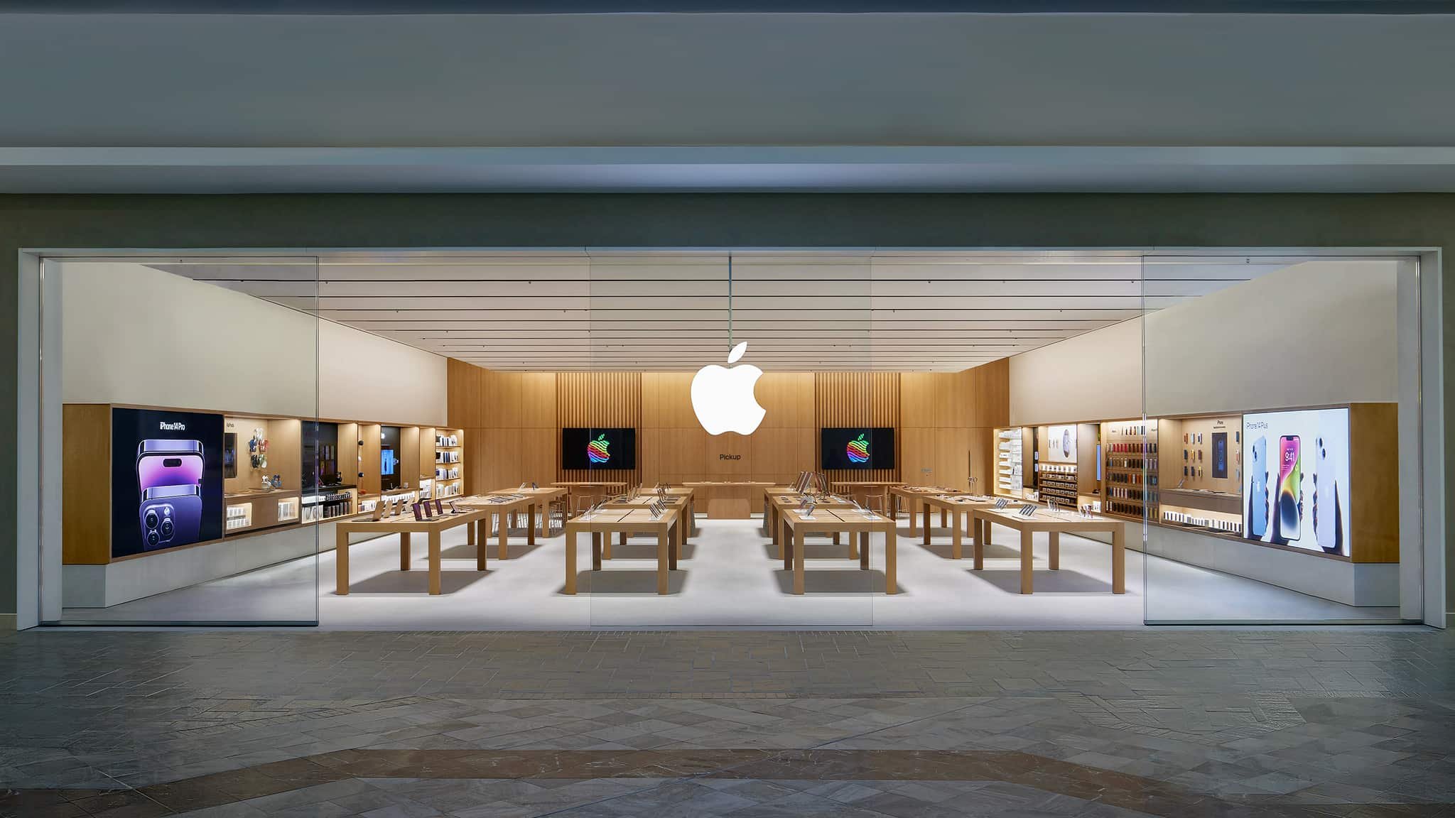
The Apple Store at Lakeside Shopping Center, LA.
Apple’s retail stores are iconic for their minimalist, almost sci-fi interiors. Long tables in spacious environments, rather than private rows of shelves, invite shoppers to try out products. When shoppers talk to staff (referred to as Apple Geniuses), there’s an intimate feeling within a larger space. It gives the impression that several small conversations are happening around you at any given time, and you’re a participant in the store even if you’re not engaging.
Even the way Apple’s staff talks to you and relies on visible technology to communicate helps cultivate an elevated but inviting sense of the overall brand.
In contrast, other tech stores like Best Buy follow a traditional retail set-up, leading to a commonplace experience, even if you only make large tech purchases once in a blue moon.
Curating your retail or office space with a specific aesthetic can elicit positive associations with your brand when people walk in. Matching workstations in the office, chic trade magazines carefully laid out in your lobby, even the wayfinding directions in your parking lot, and office signage—all of them are opportunities to communicate your brand identity with your audience.
Design Cohesive Brand Elements With Brandmint
When designing your brand elements, consider how to express your core brand through every consumer touchpoint. Think through your major unifying elements such as your color palette, symbols, and key messages before building out assets. Prioritize your assets by your most visible touchpoints (website, social media, ads, packaging) and use your strategy to guide you.
Need help crafting a cohesive brand identity? Schedule a strategic planning session with Brandmint to build your overall direction!